


Are you getting antsy about your house, or feel that it is outdated? It may be time to redecorate your home by sprucing up the furniture, paint colors, or other elements.
To bring a fresh look to your space, updating the color scheme is a failsafe. By using different colors, you can completely change the mood and theme of any room.
Accent colors are shades that you use in small amounts to bring the color scheme of a space together. Want to learn more about accent colors? Read on for five mistakes you should avoid.
1. Using the Same Color
Although you may have a favorite shade, it can overwhelm the room if you utilize it too much. Make sure you compare the colors of your furniture and paint before you start painting or buying new items.
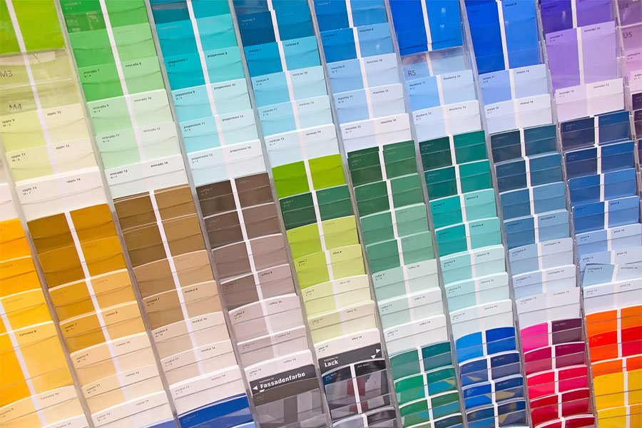
A good method to compare color shades is bringing samples home from the store. Pick out a paint deck from your local hardware store and hold up the shades against your other living room colors.
Even if you have different variations of the same color, it might still feel like too much. Add in some variation by playing with different hues to contrast the elements of the room.
The 60/30/10 Rule
Use the 60/30/10 rule if you have trouble deciding on a color scheme. This method will help balance out all of the colors working together.
The main color should take up approximately 60 percent of the space, with 30 percent dedicated to the main accent color. A secondary accent color can fill in the remaining 10 percent.
Although this is a great guideline, it is not set in stone. Depending on the size of your space and the colors you choose, you can always change these ratios to find a look that works better for your taste.
2. Only Going With Monochrome
Many modern homes have various shades of black, white, gray, and beige to create a futuristic feel. Although this may be appealing to look at, it lacks contrast and will not make any space comfortable.
You can still get the clean look you want without washing everything out. For instance, the main shade in your decorating scheme can be a monochrome color. Contrast that with vivid hues for your accent colors.
Even one accent piece in a monochrome room can brighten up the space. For instance, stylish rugs protect your floor and provide a design element to focus on that distracts from the monochrome colors.
Monochromatic tones seem like an attractive choice at first because you don’t have to pick out a color palette. However, the tradeoff is that the space will feel washed out and muted, taking away any personality.
3. Color Clashing
On the opposite end, color clashing can create a busy look that is too overwhelming. If you use too many vivid shades, they will compete with each other and not create a cohesive look.
Try to add accent pieces slowly to see how they work together. An accent lamp might not be too irritating, but multiple bright shades close together will look too busy.
With color clashing, you can find a delicate balance. Too little color clashing will not bring enough life to your space, but too much will look garish.
Complementary Colors
If you have shades you like, take a look at where they fall on the color wheel. They can clash but still complement each other beautifully in many design styles.
Combine both warm and cool undertones to contrast colors without making the space feel loud and tacky. Some of the best color pairings include:
- pink and red
- orange and green
- red, yellow, and blue
- black and navy
- orange and blue
You can also break the complementary color rule if you only use small accent pieces with very vivid shades. Ultimately, it all depends on your personal style and what you feel comfortable with.
4. Too Many Patterns
Patterns are a fantastic way to liven up a room without using excessive amounts of color. You can find pieces of furniture in your desired patterns and shades without making them clash.
Even if you enjoy patterns, avoid using them excessively. Use accent patterned pieces thoughtfully against solid colors to make them really stand out.
Some of the most popular choices for patterned furniture include chairs, couches, and pillows. These can contrast nicely with your living room colors.
For an even bigger impact, try a patterned accent wall. This type of wall works best when it is in a room with neutral walls, such as gray, white, or beige.
Similar to paint strips, you can test out several wallpaper samples to see which will look good with your design styles. Make sure to install your wallpaper properly so it will last for years to come.
5. Going Too Dark
While avoiding white and gray monochrome, you can also go too dark with your decorating scheme. One of the best interior design tips is to break up dark spaces with contrasting furniture of lighter shades.
In addition, dark decorations can make an already-small space look even smaller. If you want a room in your house with a very dark color scheme, try to use the darker hues for your living room colors, rather than a den or a bedroom.
Lighten up a dark room with pieces that pop. You can use the 60/30/10 rule and still have black or navy as your primary color. Just make sure that the hues do not overwhelm the room and create a gloomy atmosphere.
Use ambient light and mirrors to quickly lighten up a room and make it more inviting.
Steer Clear of These Mistakes With Accent Colors
You shouldn’t be afraid to spice up your home with accent colors. Using this guide, you can safely navigate color coordination in your space without feeling overwhelmed.
Want more ideas and inspiration for your next home decorating project? Take a look around the Lifestyle section of our site to learn more.


